The Automotive Art of “AF and VK”
A top designer reviews the mastery of Art Fitzpatrick and Van Kaufman
Peter Stevens is one of the world’s best-known and most sought-after automotive designers. He is a consultant designer who is committed to the vital importance of design education. Alongside his consultancy, he lectures internationally and was until recently Visiting Professor at London’s Royal College of Art. Professor Stevens is well known as the designer of the acclaimed McLaren F1 road car which marked a paradigmatic shift in high performance car design. Produced between 1993 and 1997, the car remains extraordinarily influential.
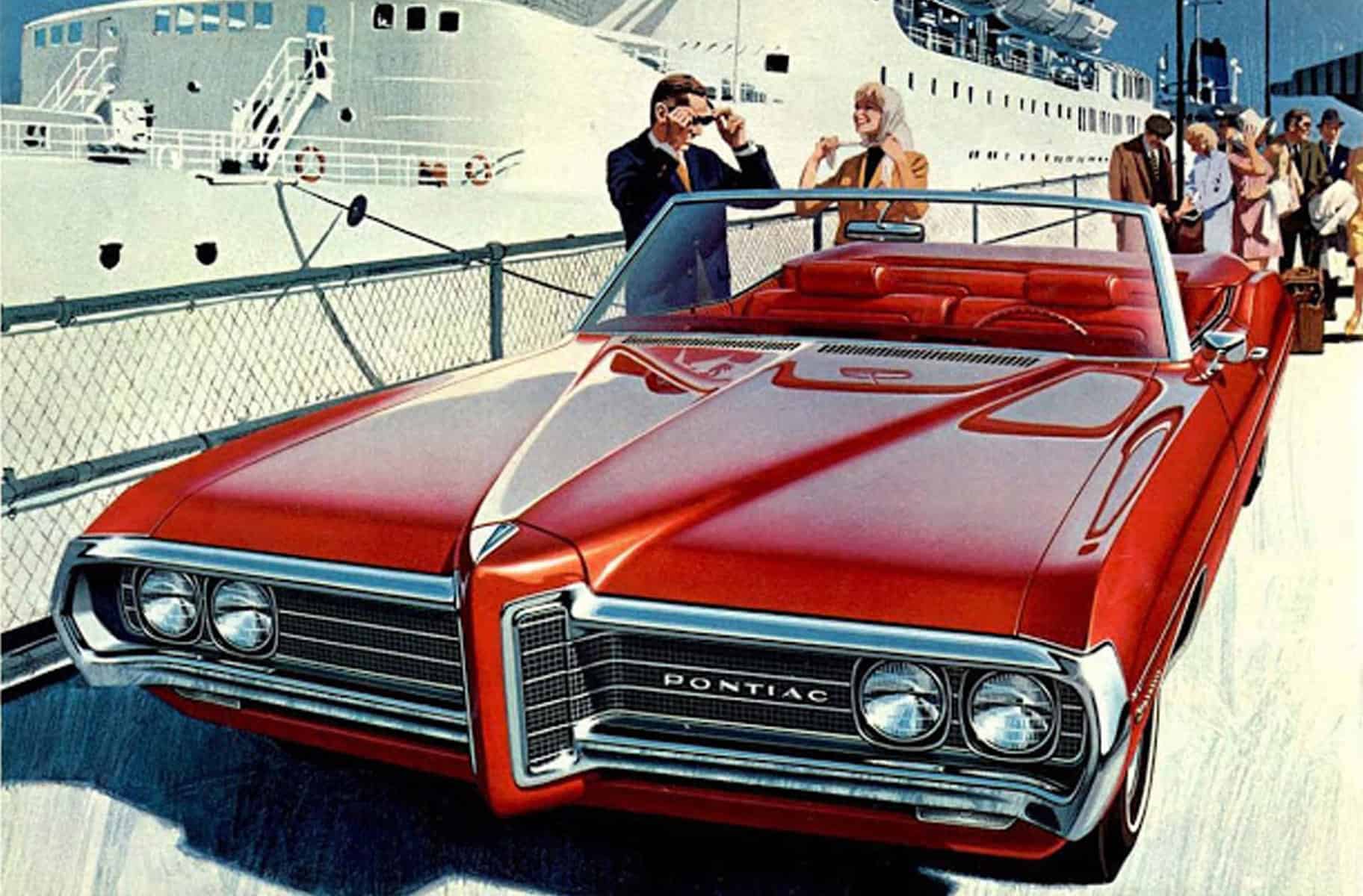
It was not long after joining the design department of the Ford Motor Company way back in 1970, having graduated from London’s Royal College of Art Vehicle Design School, that I made a great discovery. Nosing around in the bottom drawer of the Exteriors Studio’s big old plans chest, I came across some ’60s Pontiac sales brochures.
The studio was about to clear out what they called “a load of old junk” – previous designers’ work, a few ancient, dog-eared magazines, sheets of “old fashioned” Canson colored paper, and some past Pontiac brochures. Inside the brochures were not photographs but fantastic illustrations done by two people whose initials at that time meant nothing to me – AF and VK, or occasionally VK and AF. One particular illustration I found spellbinding: a Pontiac Tempest Coupe has stopped next to a flower stall. Rain is pouring down and a smartly dressed woman is talking to the flower seller while either opening or closing her yellow umbrella. On the hood top the rain is beading in the way that it does on a freshly waxed car. And the wonder of the illustration is that the colors of the flowers are reflected in each drop of water!
At the time, I thought, “does this sell Pontiacs or is it a couple of guys having fun at Pontiac’s expense?” – a cynical young designer’s observation perhaps. Well, much later I discovered that, yes, it did sell Pontiacs. During the “AF and VK” period, 1959 until early 1972, Pontiac sales climbed from number six in sales to number three. At that time, John DeLorean was general manager of Pontiac and, having seen the work of Art and Van, he supposedly said, in the way of a commandment, “Let Fitz and Van do it all.”
Before the internet became an astounding source of information, it was difficult to find out who these anonymous characters were. AF was Art Fitzpatrick and VK was Van Kaufman. Art’s grandfather was an architectural illustrator and his father worked for Disney as a background painter, so he was familiar with the craft. It therefore comes as no great surprise that the young Fitzpatrick chose to go to Detroit’s Society of Arts and Crafts college. He hoped to become a car designer and, after graduation, the twenty-year-old joined Briggs Body Company, where he worked on the 1940 Packard 180. The Second World War saw him serving in the Naval Aviation Training and Naval Office of Research and Invention groups. He was offered a job by Mercury to illustrate their postwar advertisements before he had left the navy.
It was at Mercury that Art Fitzpatrick proposed Van Kaufman as a fellow illustrator, the start of twenty-four years of professional collaboration and forty-three years of close friendship until Van’s death in 1995. Van attended art school in California and then joined Walt Disney Studios as an animator and later a director. He served in the U.S. Army Air Force, where he both produced and directed training films during the war, then he returned to Disney before traveling to Europe, where he lived for some years. Fitzpatrick had seen Kaufman’s advertising work and suggested to Mercury that Van be employed to work on the backgrounds for their advertisements.
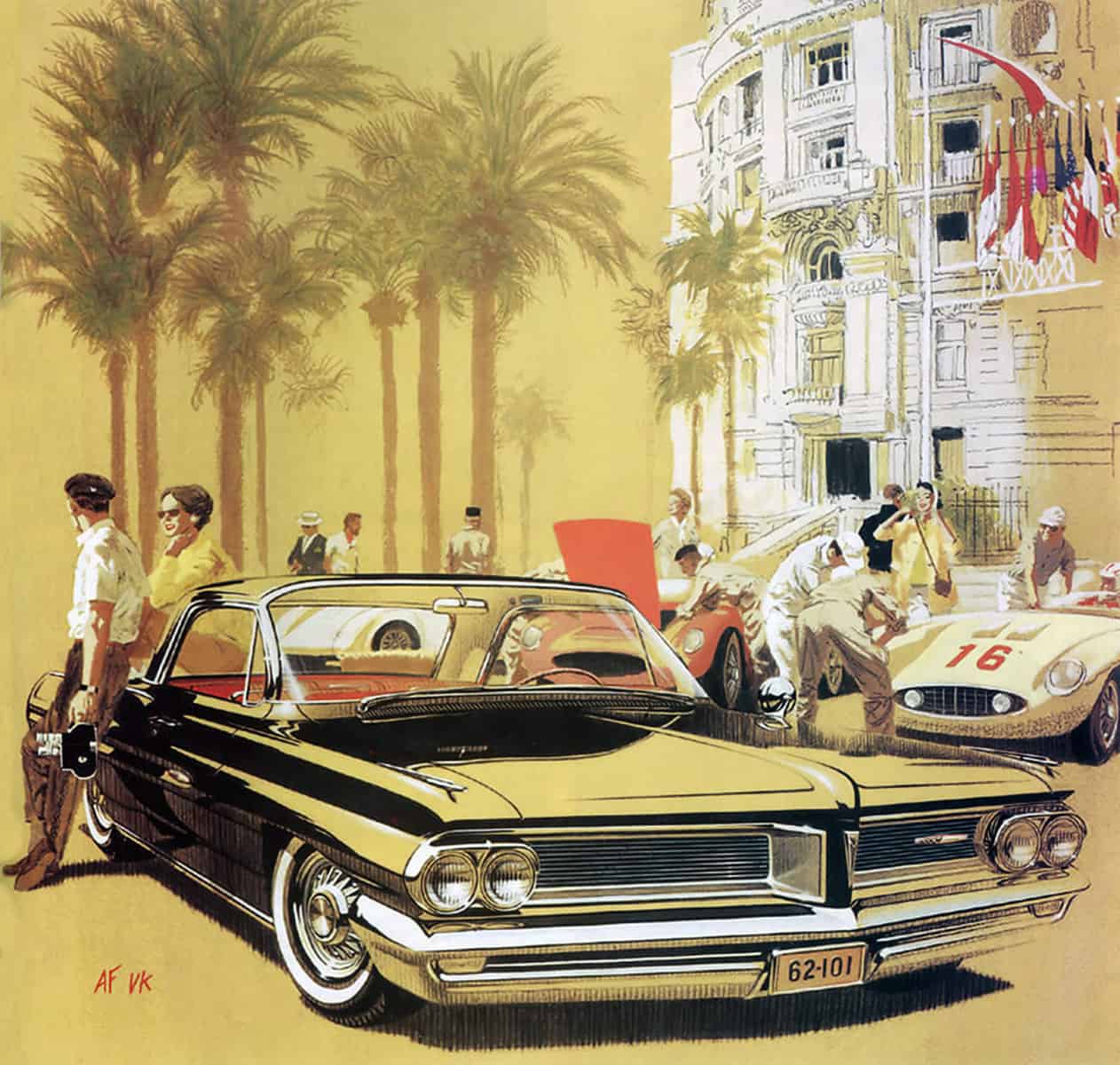
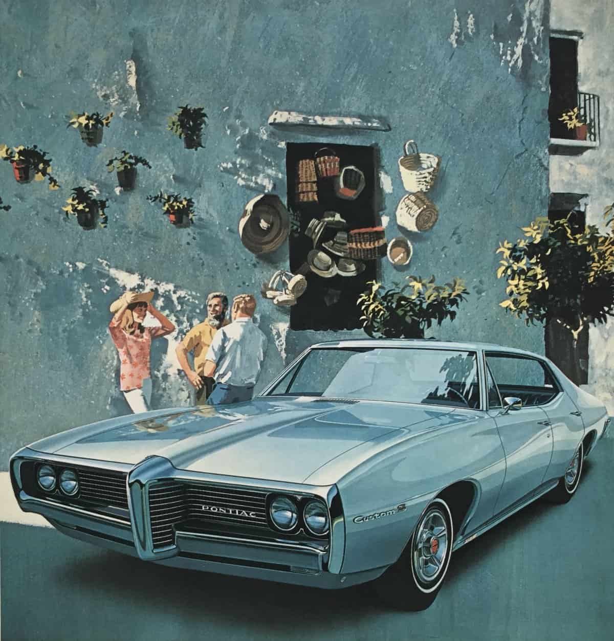
Uniquely, they worked both together and separately; they would travel to locations that they thought would make the type of backgrounds that suited Pontiac’s objectives of expressing high-style living and exotic pastimes. They would take literally hundreds of photographs and catalogue them very carefully. When a new advertising campaign or brochure was required, they would have lengthy sessions deciding which were most suited to the new car. Meanwhile Art would take a large number of images of either the first prototypes or pre-production cars. These were then made into large-format prints. He would trace over these pictures and slice the drawings into pieces and maneuver them to, not so subtly, widen, lengthen and lower the cars. At this point Van would go back to his own studio and paint his background whilst being very aware of Art’s chosen perspective viewpoint. This background painting was then handed over to Fitzpatrick to gouache paint his car over the top of the earlier painting from Kaufman. When you look at the finished illustrations the cars always have a perfect relationship with the ground, they never look as if one or more of the wheels are in a hole in the road! The “vanishing points” of the perspective of the car and background are always perfectly concurrent.
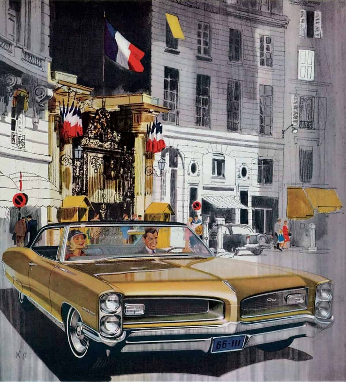
One of the techniques that I particularly admire is seen in a number of illustrations. It is where Van’s background wash painting is allowed to show through some areas of Art’s car illustration. The effect is to make the bright chrome bumper, for example, look as though it is reflecting the ground on its lower surfaces, or a shiny hood top is reflecting a building behind it.
Van Kaufman died in 1995 and Art Fitzpatrick in 2015; Van had moved quietly into retirement, but Art continued to lecture to students in design colleges and gave a few enlightening interviews. In these he displayed both a critical view on more recent advertising and a laidback ability to reminisce on his Pontiac and later Opel years. “I’ve always maintained that a picture of a car moving doesn’t mean a thing. They all move. You have to convey something about the car psychologically. It’s all about image. That’s the reason people buy cars.”
Working for Pontiac, Fitzpatrick was always able to use a company car – he was loaned twelve new cars every year for almost twenty years. He commented, “I had twelve company cars a year, three at a time. That’s three new cars every ninety days. I never formed a sentimental attachment to any one car, they came and went so quickly. There were some I thought were the best looking, but I never fell in love with any particular model.” He also said that he was uncompromising in his method of working; the customer said what car they needed to publicize, and Fitzpatrick decided on the rest. He particularly disliked “layouts” from an advertising agency.
One of the things that I found to be very influential in my work was Art’s use of dramatic reflections to describe the form of a car. One of his stories concerned an advertisement for Buick. “I did one ad for Buick that the sales manager didn’t like. It was a black Roadmaster underneath the canopy of the Beverly Hills Hotel. I reflected the green and white stripes of the canopy on this black car. I thought it was great. He didn’t buy it. He didn’t know what that stuff on the hood top was.” I had a very similar situation at a time when I was making a large number of sponsorship proposals for a friend’s touring car race team. We made a presentation to hi-fi company Akai for a Golf GTi race car. The black surfaces gave me a great opportunity to make a lovely shiny image with a blue sky reflected on the roof and hood top. Red and white track edge reflections on the lower sides. The managing director of Akai studied the illustration for a long while and then said, ‘I can’t see how you will paint all those complicated colors on the panels. Won’t it take away from our Akai message?’ Having arrived in a black Golf, I took him to the window to look at the reflections on the car. ‘Good heavens,’ he said. ‘I had never noticed that before.’ We ended up having a very productive relationship with Akai for a few years.”
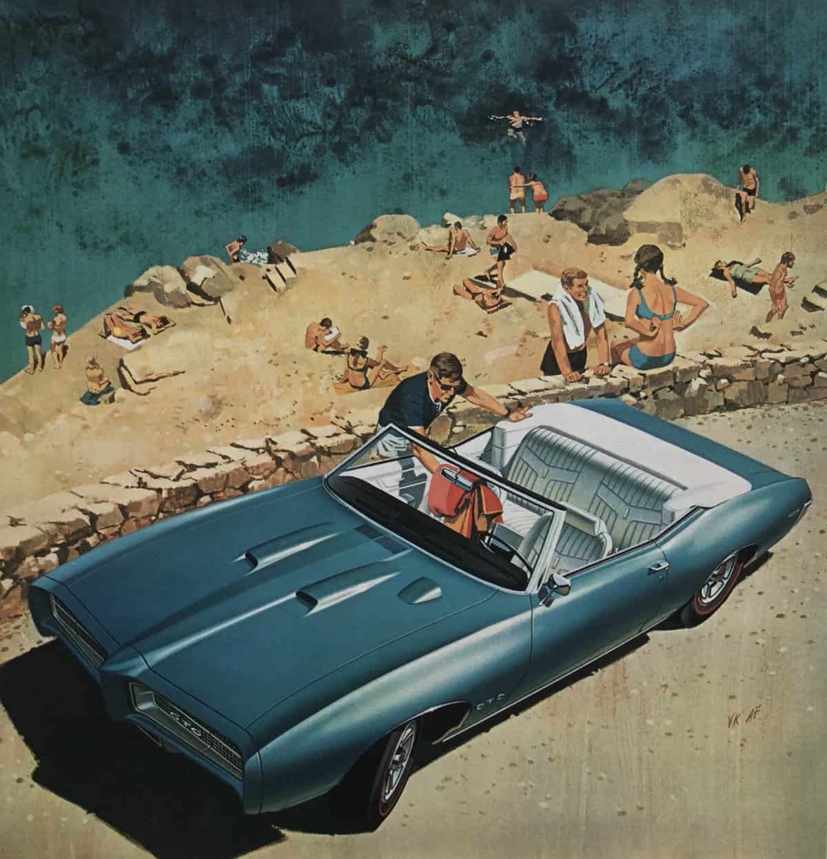
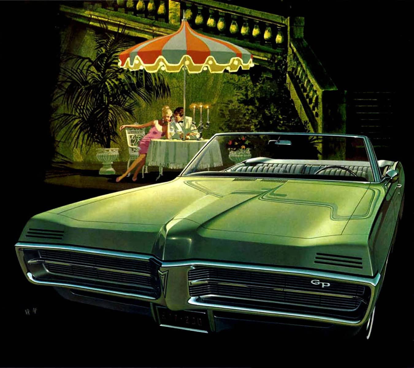
Something that you notice about an AF and VK illustrations is that no one is ever looking at the car. There may be one person or a couple interacting with someone sitting in the car, but it is that personal interaction that is the focus. Or there may be one or more persons leaning against the car looking away from it. It is the situation in which the owners find themselves that is important and maybe that situation is thanks to Pontiac. Sometimes a figure such as a woman with her bicycle is standing in front of the car obscuring our view, or the image of the car is cut off because it is longer than the advertising space given to it. All of these visual tricks suggest how confident Pontiac was in its “Wide Track” offerings, the subtle inference being that the owner was a person of great personal confidence too. When asked what Fitzpatrick found special about the design of the cars he illustrated for Pontiac, he said it was the front end. He felt that this feature was so strong that he could draw what he called a “seven-eighth” view – mostly front, and a little side view. This allowed him to enlarge the image to 60 percent of the page. “The side view only took 15 percent of the page, which was costing hundreds of thousands of dollars, by the way,” he commented. He was often asked which were his favorite illustrations and would always pick the same three. “I did one of a green ’69 GTO convertible. It’s near a cove, and there’s a diver with a mask, you can just see his head. That’s me! That is the most popular one, though I don’t know why. Another is a ’67 Catalina in the moonlight, with a couple out on a raft. An all-time favorite of mine is a ’60 Catalina with a man in a harlequin suit. There is confetti caught on a wiper blade that makes a nice reflection across the hood.”
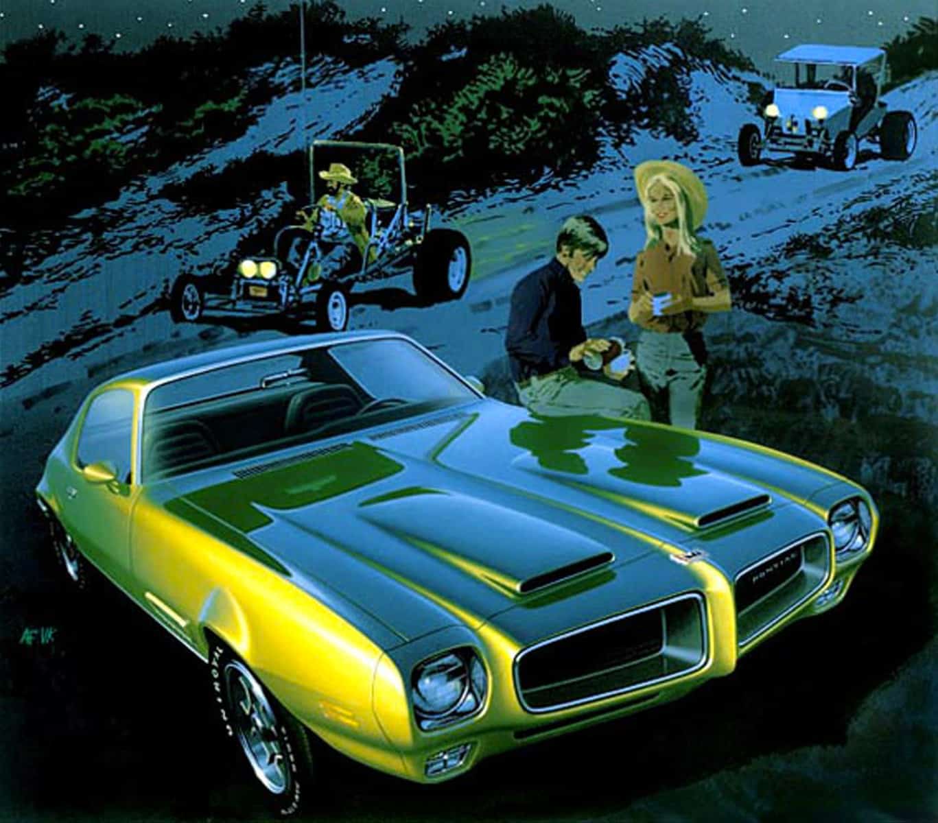
Both Van and Art had a very astute understanding of who the potential customer was for the different models in the Pontiac range and so their backgrounds, viewpoints, and choices of color were cleverly directed toward the age or income group that they were targeting. The images that were intended to attract the more mature customer would have subtle sunlight and dappled shade, or romantic moonlit situations, and nights on the town, always very low stress with a muted color palette. For the middle-aged there were the trappings of success – yachts and boatyards, escapes to the country, foreign travel, and meetings with close friends, the colors always refined. For the younger customers there were sports going on in the background – sports car race paddocks, perfect sunsets, beaches and surfboards, dune buggies, skiing, and horseback riding locations in colors that were always strong with sunlight reflecting off bright metallic hood tops.
The most important aspect of Fitzpatrick’s drawings is his supreme drafting skill. His perspective, though exaggerated, is always perfect and his brush work using gouache paint is faultless. The sketched-in cars in the background, the work of Van Kaufman, are all recognizable and again beautifully rendered.
So what is to be learned? For me it is that perfecting one’s skills and always looking to improve techniques while being aware of social and cultural change is what we need to do as designers. Easy? No, even if AF and VK made it look so!